I am sure you would agree when I say tracking your dividends and portfolio performance is one of the most challenging aspects of dividend investing. Most excel formulas work for few months before having issues with data providers leaving you helpless.
What if we get the data directly from the source? IEX is an exchange that provides an Application Programming Interface(api) to get dividend data for free and reliably.
In this blog post we will make use of a google sheets, latest IEX cloud api and google finance api to create your own dividend tracking sheet.
So head over to google sheets and start a new sheet to follow along.
Just give me your version of dividend tracking spreadsheet
FYI if you do not want to go through the whole process of creating a new sheet from scratch, adding formulas, formatting it etc, you can just go to the last section and download my own google sheet. Then you can use it to do dividend tracking of your own portfolio. For other’s who want to be more adventurous, please follow along.
Stock Data sheet
Let’s first work on the Stock Data sheet, this sheet will have info like stock ticker, current price, current yield, yield on cost, quantity you own, etc. So, on the top row, let’s have these headers on a new google sheet: (I added things like Ticker, Name, Quote, Avg Cost per Share, Cost Basis, Dividend Yield, Dividend income, PE ratio, eps etc.)

Our next step is to get data populated in this sheet. in order to do so, we will make use of google finance function in sheets. Basically syntax for getting anything from google finance function is:
GOOGLEFINANCE(ticker, [attribute], [start_date], [end_date|num_days], [interval])
So, the ticker name is mandatory and after that you can have 1 or more attributes.
- Going back to our sheet, you need to populate the column A with ticker of your stock. To populate its name, you can use =GOOGLEFINANCE(A2,”name”) under B2 shown below

- Similarly, you can use formulas like given below to get other details about the respective stock:
Function & Syntax Description =googlefinance(A2,”price”) To get the latest price =googlefinance(A2,”pe”) To get the Price earnings ratio =googlefinance(A2,”eps”) To get the earnings per share =googlefinance(A2,”high52″) To get 52 week high price =googlefinance(A2,”low52″) To get 52 week low price =googlefinance(A2,”marketcap”) To get market cap of the stock After I fill some of these values for my first row, I get the following:

- When it comes to quantity purchased, avg cost basis per share, total cost basis, those depend from person to person and these values can easily be obtained from your brokerage account. After you get those you can very easily fill the following using formulas mentioned here:
Column in Excel Formula Market Value =C2*D2 Change $ =G2-F2 Change % =(H2/F2)*100 
After that, our sheet looks something like this:
- Now coming to dividends, I have observed Google’s function is not that great. Its hit or miss. Sometimes it shows dividends sometimes it doesn’t. However, I found another api we can use to get the data related to dividend columns which is more reliable than Google’s api. Its called IEX cloud API. Up until mid June 2019 they used to allow to get the dividend data for free without any registration. But now they require you to register and get an api key.
- So, lets try to do that. Head over to the IEX Cloud registration page and create account.

- Next choose the START plan which is free. It provides 500K requests to the API every month which is more than enough for a pretty big portfolio. Even if you request to get data from it multiple times a day every day for the whole month.

- Verify your account from your email and then login to the iex cloud api account. After verification, log on and from the home page of iex cloud api account, head over to API Tokens section as shown:

- Under the API Tokens section you will find your key which you can use in google sheets. Copy the publishable token as shown using the copy button.
 Now here I have 3 options to get dividend amount into your sheet:
Current Dividend (Easy to setup)
In this method, you will need to copy this code and paste it into the script editor of your google sheet as shown:
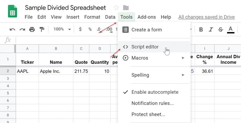

Once you do this, you are mostly done. The formula to use this script in a cell to get the dividend amount is:
=if(isblank(A11),,GETDIVIDEND2($A11,”xxxx”))


Again, you will need to replace the xxxx with your personalized api key from the last step. A11 will be the field of the ticker you are trying to get dividend info for. This should get you the current dividend for most US listed stocks. For e.g. for AAPL this will return the current latest dividend. I wrote a function that uses your key to get the dividend from IEX cloud api. Then use that and the dividend frequency to get the annual dividend amount.
Sometimes a company has just announced the most recent raise and not paid it out. In such cases, IEX returns the trailing 12 month dividend. For some stocks like BUD which pays out twice a year and has payouts where one is larger and next is smaller, this might not work. For these 2 use cases, you can take a look at the next method. Please let me know if you come across any other stocks for which this script fails below in comments. I will try and improve the script code to account for any issues you may notice. This particular formula usage is shown in line 2-4 of my sheet if you download it. Do remember to replace the xxxx with your API Key, since IEX no longer allows users to share the same key to get this data.
Current Dividend Scraping Finviz (Easiest)
In this method, we will just use the IMPORTHTML function google provides. We will then get the dividend paid out annually from a finance website and populate it in appropriate column as shown. We use the following formula in this approach:
=REGEXEXTRACT(SUBSTITUTE(index(IMPORTHTML(“http://finviz.com/quote.ashx?t=”&A3,“table”, 10),7,2),“*”,“”),“(.*) .*”)
sometimes the formula doesn’t get copied properly. So try to enter this formula manually in your google sheet.
where A3 has the ticker of the stock. I have used this in the row 5-8 of my google sheet provided. You may use this method whenever the first one fails(like in case of stocks like BUD). This method also gets the latest forward looking dividend yield just like the last one.
Current Dividend Scraping Stock Analysis (Easiest)
In this method, we will just use the IMPORTXML function google provides. We will then get the dividend paid out annually from StockAnalysis.com and populate it in appropriate column as shown. We use the following formula in this approach:
=IMPORTXML(“https://stockanalysis.com/stocks/”&A9&”/dividend/”,”//*[@id=’main’]/div[2]/div/div[2]/div[2]/div”)
sometimes the formula doesn’t get copied properly. So try to enter this formula manually in your google sheet.
where A9 has the ticker of the stock. I have used this in the row 9-12 of my google sheet provided. This method also gets the latest forward looking dividend yield just like the last one.
You can get dividend for etf’s based in USA using the below formula with slight tweaks: =IMPORTXML(“https://stockanalysis.com/etf/”&A7&”/dividend/”,”//*[@id=’main’]/div[2]/div/div[2]/div[2]/div”)
If you want to get dividends for stocks listed in TSX try the formula below: =IMPORTXML(“https://stockanalysis.com/quote/tsx/SU/dividend/”,”//*[@id=’main’]/div[2]/div/div[2]/div[2]/div”)
You can use any of the three methods for any number of rows in your google sheet depending on what works or doesn’t. I will make sure at least one of the methods mentioned above works at any given time.
- With the information about dividend per share, you can easily get information about columns on dividends as follows:
Column Formula Annual Div Income =D2*J2 Yield on Cost =(K2/F2) format as percent Annual Yield =(J2/C2) format as percent - In addition to this, I have 2 columns that I added at the end, Actual Shares Purchased & Actual Cost Basis. These are completely optional and will be used to calculate your real returns on original investment. So, if you do DRIP, this will be very helpful. These columns must be filled manually, and you need to go to your brokerage website to find this info. For instance, I have some WFC stock which I bought 3-4 years back and turned DRIP on. Now last year I bought some more WFC stock out of my own pocket so my WFC holdings in my broker account look like this:
 So, what I know is all my DRIP transactions are anything with fractional shares in quantity column and my whole number quantity transactions are made with actual out of pocket money. Therefore, I just add up the quantity columns for whole numbers to get the Actual Shares Purchased column. I add up the cost basis for those transactions to get my entry for the Actual Cost Basis column. Important thing to remember is you must update these 2 columns any time you increase position in a stock with actual money or sell some of your positions. Those transactions will affect values in these 2 columns. When you buy any new stock, value will be easy to calculate first time. It should be same as D(quantity) and F(Cost basis). So, ideally you shouldn’t be trading much and this update will be very rare.
 - And now, our first row is completely done:

- Now, in order to add new stocks, your work keeps getting smaller and easier. For instance, let’s add some tickers like BLK, DIS, MO, PSX,SO,QCOM, VFC, ZBH etc.

- After adding the tickers from your portfolio, all you need to do is drag down from bottom right of the cell of first row in a column. That will basically call the same formula for that column for all your tickers. I have highlighted the columns for which you can do this. After doing it for all these columns here is what we get:

- Now enter information in columns D, E, F, P,Q and R in that order. Rest of the columns you can again drag down as show in previous screenshot. So now we are starting to get all of our data in the stockdata sheet.

- Now, lets add some totals and calculate returns and format the table to get some colors in:
 Notice how the return incl. dividends is a tad bit higher mostly because of some highlighted rows where I assumed, I bought some shares after receiving dividends using DRIP. Please also note these are just numbers I made up, they might not be factually correct, but this is just to give an example of how you can use the last 2 columns in the sheet. This is the end to the stockdata sheet for our dividend tracking.
Pie Chart showing your Sector allocation
Now that our stockdata sheet is ready lets do some graphs. Let’s say you want to be aware of which sectors you are allocated into and how much of your total portfolio.
- Lets add a new sheet called sectorallocation and add the sectors you want to track as shown:

- Now, under the percentage column, in order to get the correct allocation we are going to add this formula for utilities := ((SUMIF(StockData!P2:P12,”Utilities”,StockData!G2:G12))/StockData!G13)*100
- What it will do is, see the sectors we assigned in our main stockdata sheet for any of the rows say Utilities, if so add the values in those rows up and divide by the total value to get the percentage allocated to that sector. Similarly, do this for all the other rows. You can copy the formula, but you will need to replace the Utilities with the sector of the row. So, we get this:

- Now, lets add a pie chart to the sheet and add your data ranges from A2:A11,B2:B11. After that, we get the following:

- At the end you get a pretty nice pie chart showing your allocation in different sectors. This can help you be aware in what sectors you are more exposed and if you decide to buy a new stock, you can see what sector you are very less exposed to and maybe look at a company there.
Monthly dividend tracking sheet
So far, we created our stockdata sheet which shows our yield on cost, annual dividends, return with and without dividends etc. Our sectorallocation sheet shows how much or less are you exposed to various sectors. In addition to these, let’s create a sheet to track our monthly dividends. This sheet will help us to create more data and understand our monthly cash flows from dividends. It can also eventually allow you to plot your dividend gains over few years/months of investing. You can see yourself on your way to living off dividends.
- To do this, add a new sheet and enter the columns as shown till December:
 Now for the first 2 columns, get the data from your StockData sheets and populate them. Once that’s done, now you need to manually fill in what dividends you got every month from different stocks. This process can be a bit time consuming. Although, you should be able to get all the data from your broker. On my broker’s website, I just login and go to the transactions screen. Then filter to only show dividend transactions. This allows me to go through a few months of transactions at a time and fill this sheet quickly. In addition, we can also enter information for 2018 and previous years if possible, in new sheets. However, this depends on if you can get the data from your broker for previous years. Then using that data, we can add some YOY(Year Over Year) percentage increases for your dividend stocks as shown:
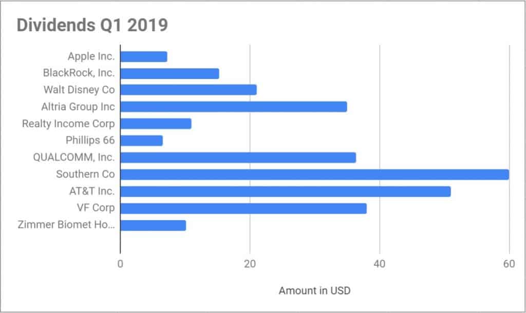
- Now, this gives you better idea of how fast your dividend is growing every month. You can even play around with some extra rows and add Year end increase in dividends year over year for the full total etc. Now lets create a graph to show dividends received form companies in Q1 2019. Lets add a bar chart to the sheet for 2019 Monthly dividends and use the following data ranges:

- Again, you can play around with the data ranges to change this chart from quarterly to annual ranges. That way you can get different type of graphs. Please feel free to check out my real money dividend portfolio which uses this google sheet in practice.

Dividends over time sheet
If you have been using this dividend tracker for a couple of years, you will have enough data for a new chart. You can track your dividends month over month and year over year. This allows us to see the dividend compounding effect over long term.
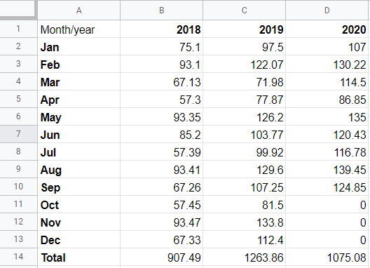
- Add a new sheet titled MonthYearSumm. Next we will just copy data from our other sheets like 2020Monthly, 2019 Monthly into the following format:

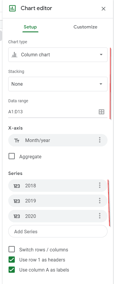
- Again remember, you need to copy the monthly dividends you made over past years in the table above. Once you have filled in the table, you can then create a new chart of type column chart with no stacking.

- You can use the customize tab to change look and feel on the chart. Once finished, the new chart looks like this:

- As you can see, this chart allows you to look at your progress over time. You can see your dividends increasing month over month, year over year. Really gives perspective into long term compounding effect of dividends if you stay the course.
OK this is great! Now give me this sheet!
I do realize making your own excel from scratch can be daunting even with the above given steps. So, in case you just want a copy of the sample google sheet. Please enter your email below and I will send you the sheet with easy to follow instructions on how you can set it up for your portfolio. Again, I think if you are buying individual stocks for dividends, its utmost important to track and measure your performance. So you know how you perform against the market and can see the effects of compounding in real time. I usually update my personal sheet once a quarter and publish my quarterly results on this blog.
If you liked this article, it will be great help if you can share it with your social circle using any of the share buttons on the post.
Also check out how I get my financial news using a free Barron’s & wsj subscription.




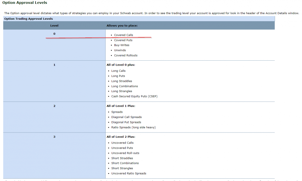 Depending on your broker, it will take 1-3 business days for them to approve you for selling covered calls for income.
 Depending on if you are enabled for options trading, you will see options under strategy. We want to choose Call here under strategy. So we are saying I want to trade (buy or sell) a call option.
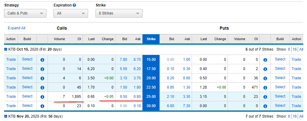 This is from a very recent screenshot, so numbers might not be accurate. Stock price was around 23$ at this time. What you see on left of the strike column are details for selling covered calls.
 What this means is, if someone enters a contract to buy a call for KTB stock for .25 cents or higher with expiry of 16th October, my contract will get sold. The buyer will then have right to buy my 100 shares of KTB at pre-agreed strike price of 30$ anytime by 16th October. For that right, I get .25*100 = 25 $ commission. This part of selling covered calls for income matters to us, the call sellers.
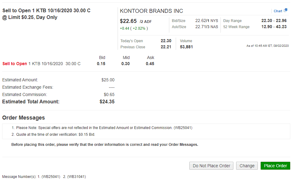 Once, you place the order and it gets filled, then you will see the commission in your account immediately. The contract gets assigned against your existing 100 shares.
  That’s it!









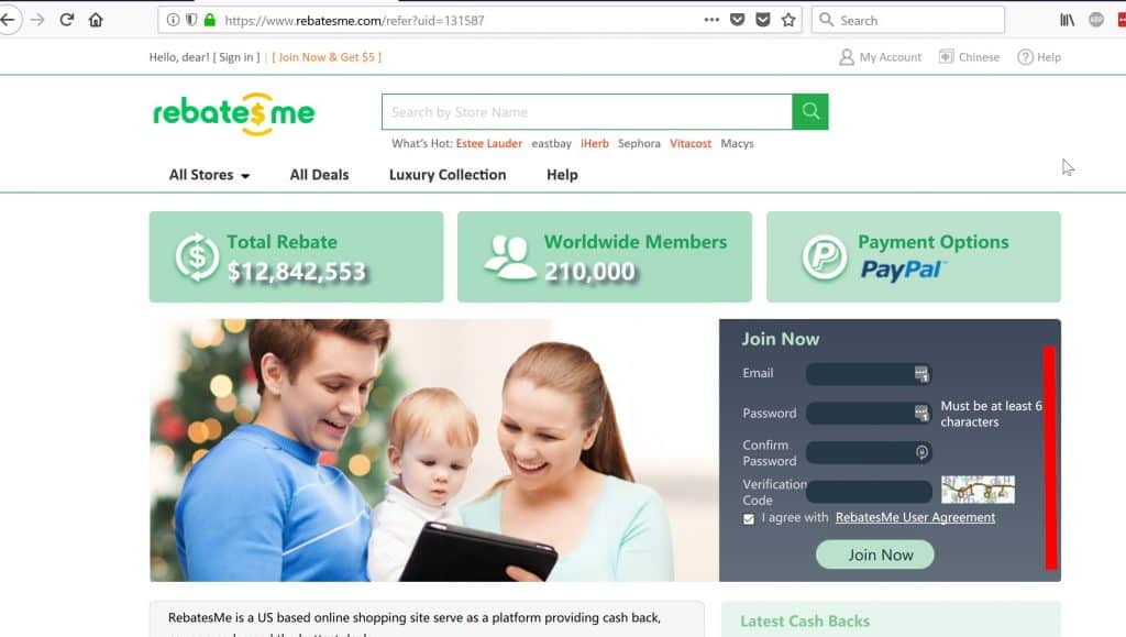

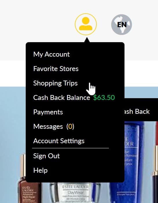
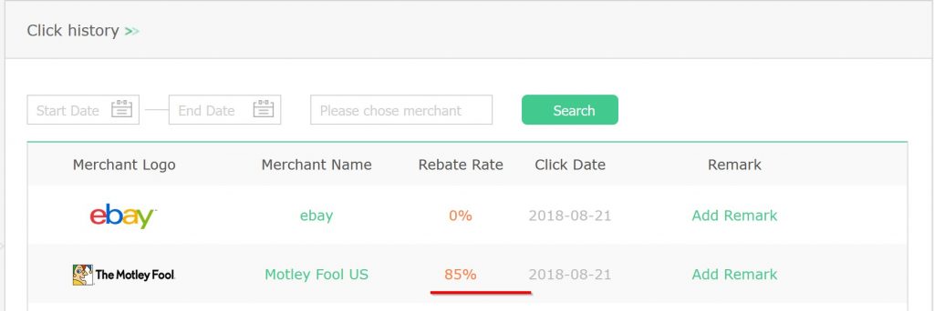


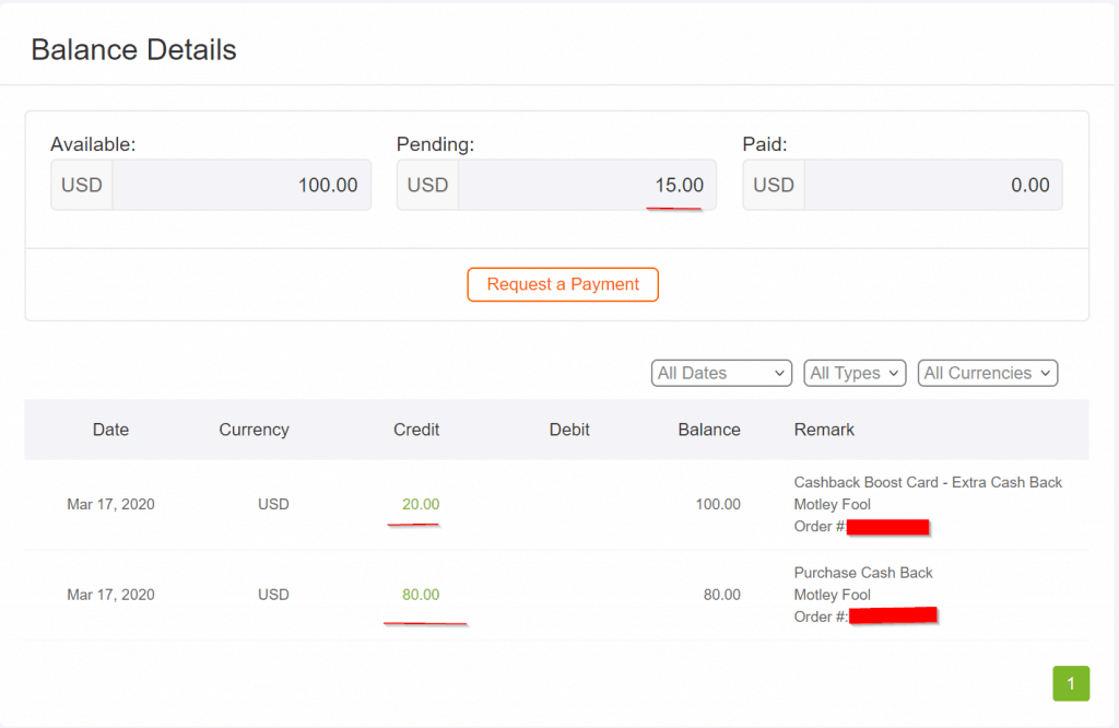
 stock advisor subscription. In my opinion it is still great deal! Especially since I have confirmed that cashback is being paid out 3 months after the transaction.


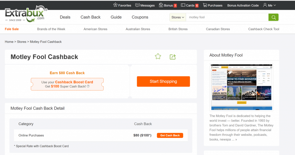


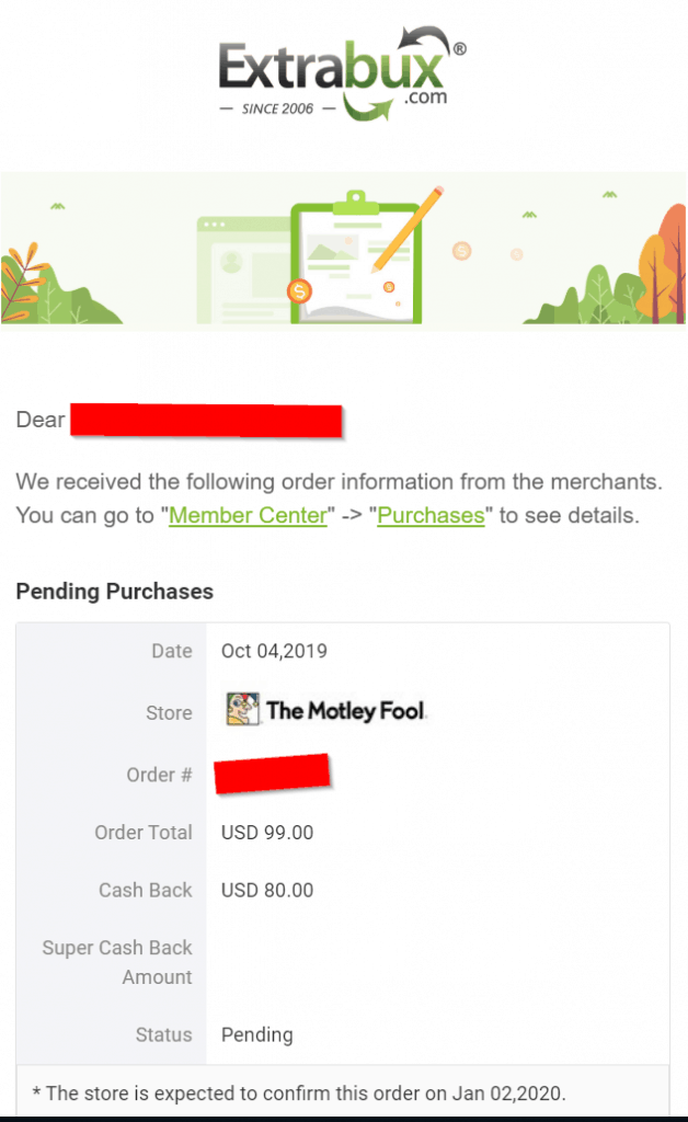
 Time for another pro tip, for new users who signed up to Extrabux just for this, seems like I can click the Boost Cashback to 100$ button and now I can see 100$ owed in back to me!! This makes my motley fool subscription absolutely free.
